Introducing the new Illustrate Digital brand
For the last few months we’ve been working hard on a new look for Illustrate Digital and we’re really excited to introduce you to it!
We’ve grown a lot in the 6+ years since we launched in 2013 and in the last couple of years we’ve really bedded into our position as European leaders in WordPress and UX Design. Whilst we’ve loved how our previous brand allowed us to communicate with the world, we started to experience challenges in the way we could apply it to different materials and scenarios. And since we’ve matured a lot, we felt it was only right for our branding to mature with us.
We’ve got big plans this year to grow and to be more widely recognised and chosen as experts in UX and in deploying WordPress websites and software. Working on the brand has allowed us to align with our ambitious marketing strategy for 2020 and beyond.
So here we go, say hello to the new-look Illustrate Digital…
Exploring the brand
A freshened up version of our logo
Funny story… we didn’t even ask for this! The sign of a great brand specialist is one who goes above and beyond because they just can’t help themselves, we’re certainly not complaining!
The new Illustrate Digital logo isn’t too different from the old one, but it’s certainly a lot more fresh. It’s exactly the same typeface as our old logo, but using a thinner weight of the font has helped us to achieve this more ‘digital’ feel.

It’s also benefited from some clever new alignment, making things a little easier on the eye. And the keen-eyed people amongst us will notice the distinct lack of a tittle on the second line – that’s the technical name for the dots above the letter ‘i’. This is to help with visibility, making the words easier to read when it’s displayed at smaller sizes whilst helping to keep things nice and clean and compact.
The code snippet
This is possibly the smartest part of our new branding. We’ve replaced the old circle style with this new code snippet. When it was first presented to us we thought it was a bit too simple, until we saw the many ways it could be used!

Of course the code snippet has a significant meaning for us. Everything we do is digital, whether that’s websites or software. It’s become the symbol synonymous with coding and software development. More specifically it’s a closing tag (without the tag name). Whilst would open up your HTML or XML markup, typing would then draw that piece of code to a close. Those with development experience will understand just how much our team will use these three symbols every hour of every day!
Even our UX designs will eventually be brought to life using code. So it’s likely no surprise that the code snippet is just as important to us as it was in our previous branding. The difference is in how we apply it and removing the circle allowed us to make it a lot more versatile – you’ll get to see more of this later on in this post.
Vibrant, digital-led colours
Contemplating and concentrating on how we use colour in our new brand was a really important part of the process. Again we loved our colours and it was fun trying to pick out gold-coloured items everywhere we went (Oliver Bonas shops are a honeytrap for this!). However we decided it was best to make a move towards more digitally-applicable colours, as this is where we do most of our outreach and marketing.
The process of reviewing colours has led us to this new, vibrant palette of digital-led colours. They’re brilliantly versatile and we’ve already had fun applying them to assets like our own company intranet with great success.

Our brief for the new ID brand was to achieve a sense of high-end and high-quality, whilst still retaining our playfulness and the importance we place on people and individuals. The combination of ‘ID Dark Mode’ and ‘ID Ultra Violet’ lands us with a digitally luxurious feel, complemented by the playfulness of ‘ID Teal’ and additional vibrancy of ‘ID Electric Blue’ and ‘ID Pink’.
The new Illustrate Digital colours give us such a buzz and that’s exactly what they’re intended to do. They reflect how we bring our client brands to life in the digital world, keeping the fun, passionate and exciting edge that clients seek us out for in the first place.
A gritty new texture
In approaching the creation of a new brand we were really intentional about not creating something that was flat and boring, as it wouldn’t feel very “us”. Illustrate Digital is a team of people with grit and with determination to do things the right way. And so it aligns strongly with our culture to see the introduction of a gritty new texture that gives life and perspective to various elements of the brand.
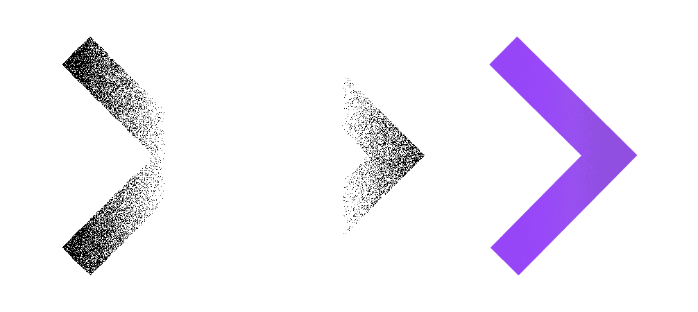
We’ve called this texture ‘Salt & Pepper’. A little shake here and there helps to add a lot of life to the graphics that we’re using on various marketing materials. And just like real-life salt and pepper, less is more! Too much would be overpowering.
Icons with a new perspective
This is undoubtedly one of the areas of the project we have been most excited about. From the moment we saw the concept for our new icons, in light mode and dark mode, we loved them.
Just scour the internet, or more specifically an icon library, for half an hour and you’ll realise fairly quickly that they all start to blend into one. We didn’t want to land in the pile of boring, samey icons; especially since a part of our own design process for websites often involves creating lively, interesting icons. Thankfully we’re pretty sure we’ve achieved this exciting look that was aimed for, we just hope you agree!
![]()
Creating a website or cloud software is a multi-layered process that takes determination to achieve well. Our new icon library at Illustrate Digital works hard to show this well-involved process behind creating great user experiences and easily manageable websites.
![]()
But it doesn’t end there. We needed a way to visually identify sections of our own content, so we extended the icon library to include a set of visuals that could be used in a smaller format with the same perspective effect that we fell in love with from the initial examples.
And just for good measure, we created a third and final set of icons that would allow us to properly describe different areas of the services we have on offer. This last set of icons are more like full graphics and are intended to be displayed in a much bigger format than the other icon styles.
![]()
Of course, the one thing you’ll notice about these larger icons is that they appear to be sat on top of a mobile phone. This wasn’t a happy accident. Illustrate Digital is a mobile-first agency, meaning that when we design user experiences we consider the mobile experience first. It’s much better to think first about the simplest and smallest version of your website platform, before expanding to a lot more space on a desktop version and we’ve found this to help in creating better user experiences.
Applying the brand
Finally, now that we’ve explored the elements of the new ID brand, we can talk a little bit about how this all gets applied to our marketing and other digital and physical materials.
This fresh new version of our identity as Illustrate Digital is a super-versatile brand and we’ve created a lot of materials with this already. Everything from proposals to letterheads, t-shirts to pull-up banners, and social media posts to email signatures, it’s all been well-considered and ready to roll.
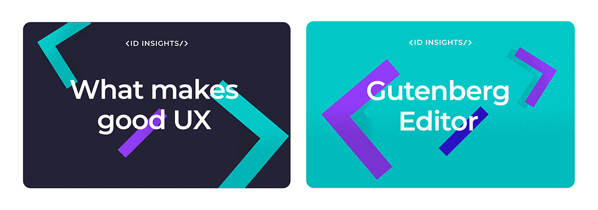
There are some key graphics that we want to share with you here though, as you’ll start to see more and more of these floating around the internet and on social media. They were an important part of the brief for the new brand.
We create a lot of content for the Insights section of our website, to help educate clients and passers-by. These new graphics help to bring the Insight articles to life and show how easily the code snippet can be used in a lively and engaging way.

Additionally, since we attend many events, appear on podcasts and are invited to speak at events about our expertise, we’ve created a brilliant new set of graphics to promote these events. It’s another stroke of genius from Rob, the branding specialist we hired for this project (we’ve written a bit more about him further on) and shows how well those three code-related symbols can be applied.
What’s next for the ID brand?
We’re really proud of our new brand and really excited to continue rolling out the new materials we’ve worked to create over the last few months, but we’re not quite finished yet!
For now we’ve applied the new styling to our website, but in the coming weeks and months we’ll be working on a brand new, improved user experience and rebuild of the Illustrate Digital site.
We don’t want to give the game away, so won’t share any more just yet, but keep your eyes peeled for further expansion of this exciting new identity.
More about the man behind the brand
We want to give an extra special shout out to Rob Barker, who has worked tirelessly on this project with us over the last few months. He has implemented our brief to a tee and has poured his passion and creative genius into the concept and application. In his own words:
“Having worked with Illustrate Digital a fair bit in the past meant that I already had a good understanding of their personality as a brand and their vision for the future. This made coming into the rebrand process much simpler.
My approach was to take them on more of a natural progression from where they already were. Instead of making big changes to try and reinvent them, I aimed to retain as much of the existing brand as I could. By updating their existing logo, tweaking and expanding their colour palette and simplifying their typography, I think I was able to achieve this.
By making more of what they already had, I was able to create an exciting new design language that can be both vibrant and fun, as well as subtle and serious when it needs to be. I really feel that the new brand captures the essence of Illustrate Digital and I’m looking forward to seeing them roll this out and take it forward.”
If you’d like to work with this creative genius and all around great guy, you can find him and more of his excellent work here: themothership.design

