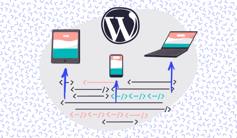
How a static website works
When websites were first built they really only accessible by computers with smaller screens using modems to connect to the internet. Websites were built as if you were printing something – the paper size was fixed and once printed it didn’t change. If your screen was smaller or larger? It was just like printing on a different sized piece of paper – the site just got bigger or smaller without changing.
Mobile phones, tablets, laptops and massive screens
These days the internet and websites are consumed on smartphones, tablets, phablets, laptops, netbooks, computers with small screens, computers with enormous screens, TVs and any number of other internet connected devices. These devices are connected to anything from a mobile data connection such as 3G all the way to superfast fibre internet that can be hundreds of times faster.
This has led to new ways of handling all these different situations without having to build a website for each. Connection optimisation techniques help improve how websites work on different connection speeds and, though they are different, have a lot in common with optimising websites for different device sizes.
Responsive websites allow a website to adapt automatically to many different screen sizes without the need for a separate website for each device.
How layouts work or don’t on different screens sizes
The challenge is that what works on a large desktop screen simply won’t work on a small smartphone. If you crammed everything you designed on desktop to your phone it would be too small to see. If you stretched everything on a phone to fit your desktop everything would be enormous and a poor use of space.
How to consider content on larger and smaller screens
To create a good user experience on many devices you have to consider what will work in each case. Common design on smartphones involve a “single column” layout where everything is stacked on top of each other.
This maximises the smaller available screen space so that content can take up as much space as possible.
The other end of the scale can be handled in a few ways. You might hear terms like “mobile first” that work on the principle that you build for mobile first and then as the screen gets larger you adapt the design and add in additional features that suit the increased space. One of the most common techniques is to start increasing the number of “columns” or elements that show per line to create a more pleasing layout.
A separate website for each?
There used to be a time when you would often see specific “mobile sites” that would be a completely separate site and accessible by visiting something like http://m.yoursite.com. The benefit was that you would have a site specifically built for mobile phones. The downside is this would involve maintaining and paying for two complete websites.
Modern web technology has found a way around this and allows us to use responsive technology to create “fluid” sites that change automatically when you are on a different screen, cutting out the need to maintain multiple versions of each website. Pretty nifty.
The benefits and challenges of responsive design
Additional time / resources upfront
Responsive design does require additional time to design and perfect the user experience but this additional time is far outweighed by the fact that you are then building a single website for all devices. The other benefit is that responsive techniques allow you to build for a range of screen sizes and not just one or two. This means you can have a layout that changes for a mobile, tablet, small desktop, larger desktop and just about any device that might visit.
This has completely changed the way we look at browsing the internet and is incredibly important when some sites are viewed more often on a device that isn’t a desktop.
Sometimes having trade-offs for speed or per-device optimisation
Responsive design like any other part of building websites has to be built within a certain budget and deadline. This means that certain trade-offs exist. This means that although responsive sites are great – they are not necessarily perfect in every situation. A common issue with poorly built or cheaper sites is that images are not optimised for different devices. This means that if you uploaded a larger image size that is a few megabytes, that might be the same image used on a smaller screen that will download the whole image and simply shrink it down. This leads to poor speed on mobile data connections.
Another thing to be aware of is the increasing number of devices being released with unusual screen technologies. Smartwatches, foldable screens and unusual shaped screens. These create exciting opportunities for a developer to get creative but they can also mean that a responsive website may still not look its best in some cases.
There are many different ways to overcome these challenges and your web agency or developer should be able to advise you on the best way to achieve this.
Using specialised techniques such as SVG
The increasing need for better responsive technologies has led to benefits that go beyond simply screen size. The rise of the use of SVG instead of traditional JPG or PNG images is a good example. An SVG is an alternative to standard images for computer generated imagery. The benefit is that file sizes or fractions of standard imagery with the added benefit that the image can scale without pixelation to any size.
New techniques and technologies are being developed all the time. If you would like to know how some of these technologies could benefit your website, your customers and potentially optimise your website then please do reach out.


